Researcher Portal
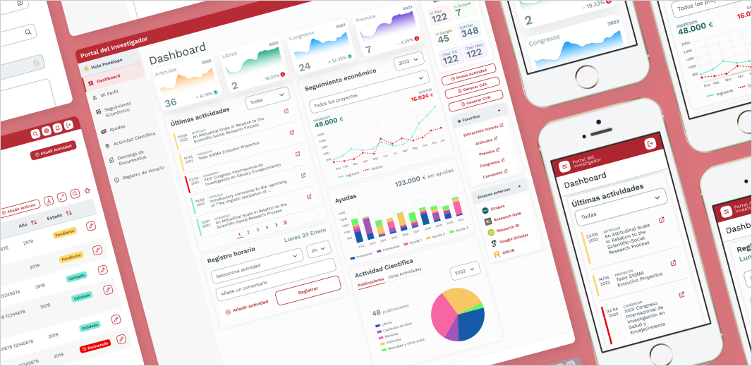
Date: Dec 2022 – Apr 2023.
Description: Redesign of the financial and content management platform for university researchers.
Role: Senior UX/UI Designer (Team of one).
Platform: Responsive web (desktop, tablet, mobile).
Methodology: Agile & Design Thinking.
Tools: Figma and Miro.
Context
In late 2022, a university organization commissioned us to redesign its Researcher Portal — a central hub where academics register and manage publications, funding, patents, conferences, and their financing.
The portal also served as a collaboration space, but over the years its aesthetics had become outdated and usability had declined.
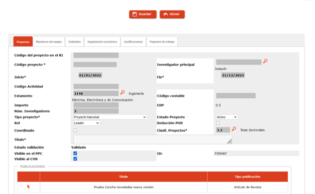
Old project registration page
The problem
The legacy portal suffered from poor usability, an outdated interface, limited responsiveness, and a lack of multilingual and accessibility support.
Users — researchers and administrative staff — faced overwhelming menus, lengthy forms (over 50 fields!), and inefficient workflows, which led to a drop in usage.
"Our goal was to create a more intuitive and efficient portal that would allow researchers to find information more quickly and easily."
Proposed solution
Our consultancy designed a UI overhaul focused on UX and creativity, aligned with the client's needs and using Agile + Design Thinking. We maintained close collaboration with both business and users, delivering phased validations to minimize rework in development.
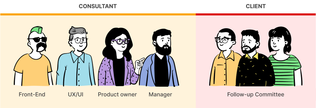
The team
A multidisciplinary team — from our consultancy and the client — collaborated closely throughout the project.
Process
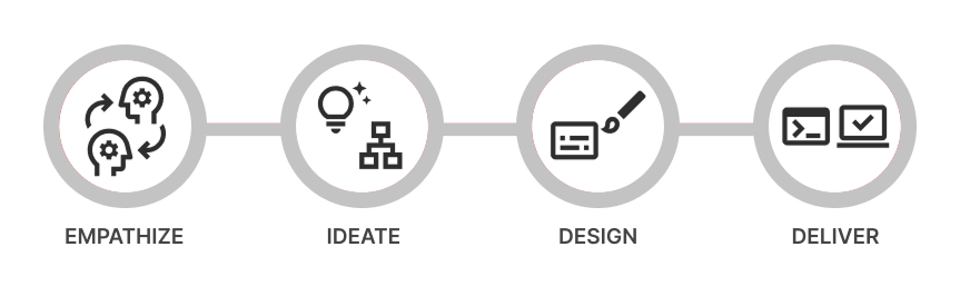
We used a "Discovery Design" approach — our internal blend of Design Thinking and Agile, structured in four phases: Empathize, Ideate, Design, Deliver.
1. Empathize
We ran sessions with stakeholders and users to understand the portal, its technical constraints, user needs, and context of use.
The main challenges included:
- Outdated interface and non-responsive layout.
- Complex information architecture: up to 60+ menu items across top levels and sublevels.
- Heavy forms with more than 50 fields.
- Lack of multilingual support.
- Accessibility below AA standard.
2. Ideate
We ideated with the client and users, prioritizing ideas and sketching the new information architecture, navigation structure, and main portal templates.
Core design principles:
- Simplified navigation (top + side).
- Personalized dashboards for quick access to tasks.
- Responsive design with a consistent tone and accessibility.
3. Design
Validated wireframes led to high-fidelity designs based on the client's branding and AA-level accessibility. We built a complete UI Kit including colors, typography, grids, spacing, shadows, buttons, forms, tables, modals, and notification systems.
We designed templates for desktop, tablet, and mobile for listing screens, detail views, forms (often in modals), notifications, time tracking, and the responsive dashboard.
4. Deliver
Testing was iterative, using Figma prototypes to validate navigation clarity and usability and to minimize corrections during development.
The new dashboard replaced the default blank screen, surfacing key metrics and tasks through cards and tabs, reducing cognitive load and improving user focus. It worked smoothly across all devices.
Results
The new portal launched successfully and received excellent user feedback:
- 28% increase in publications submitted.
- WCAG AA accessibility compliance.
- 43% reduction in support tickets.
- Higher engagement and return visits.
Key takeaways
- Designing for complexity requires simplicity: even the most technical tools can be usable when we focus on clarity, hierarchy, and progressive disclosure.
- Co-creation accelerates adoption: early collaboration with stakeholders and users helped ensure the product met real needs and built a sense of ownership from day one.
- Accessibility must be intentional: meeting WCAG AA standards required attention to color contrast, keyboard navigation, and semantic structure from the start.
- Small changes have a big impact: introducing a dashboard and reorganizing menus significantly improved engagement and wayfinding — without changing the backend logic.
- Design is never finished: prototyping and continuous feedback cycles helped us catch usability issues early, but also showed that user needs evolve over time.
Conclusion
In summary, the Researcher Portal redesign improved usability, accessibility, and adoption — reinforcing its role as a key tool for academic teams.
Design gallery
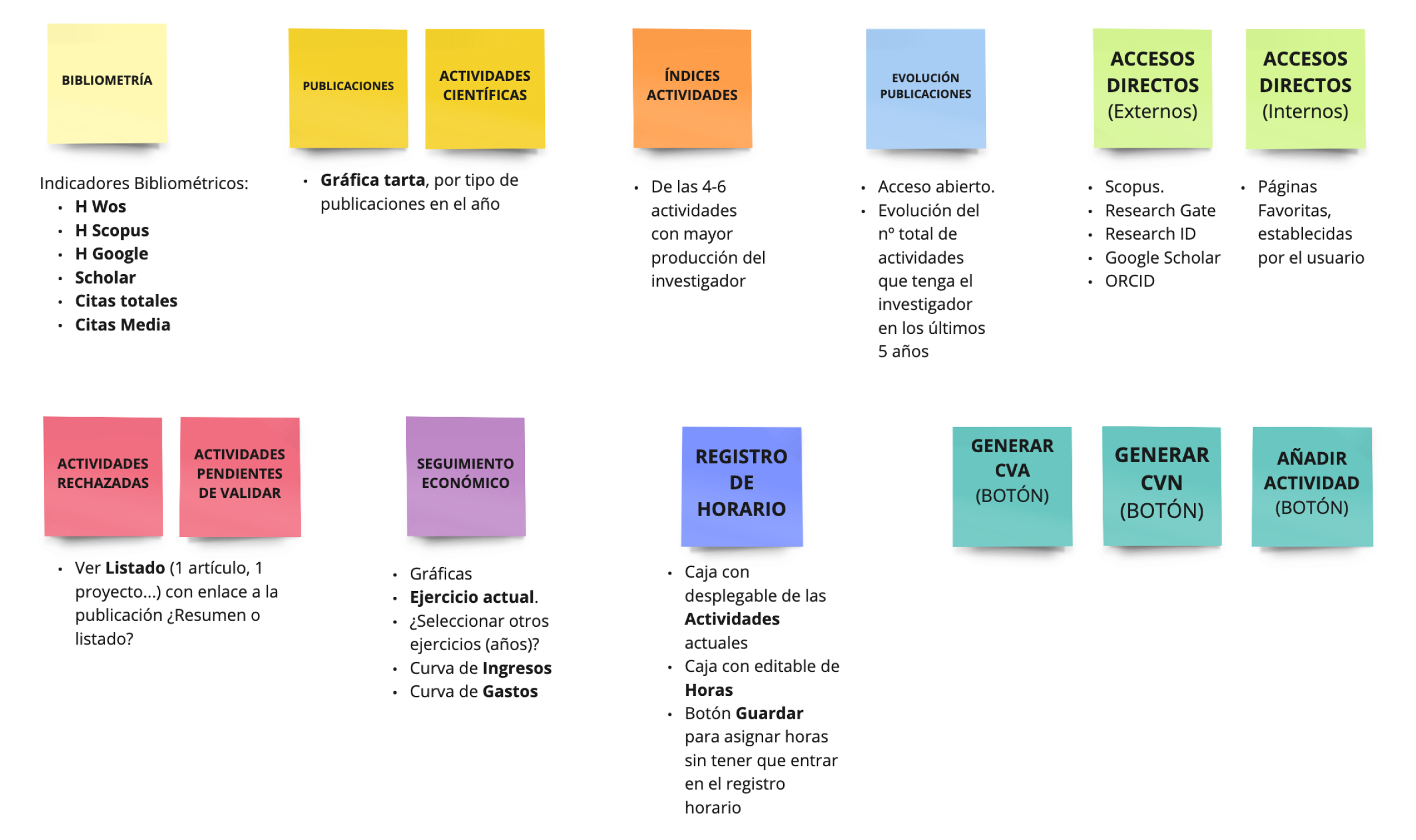
Dashboard content board
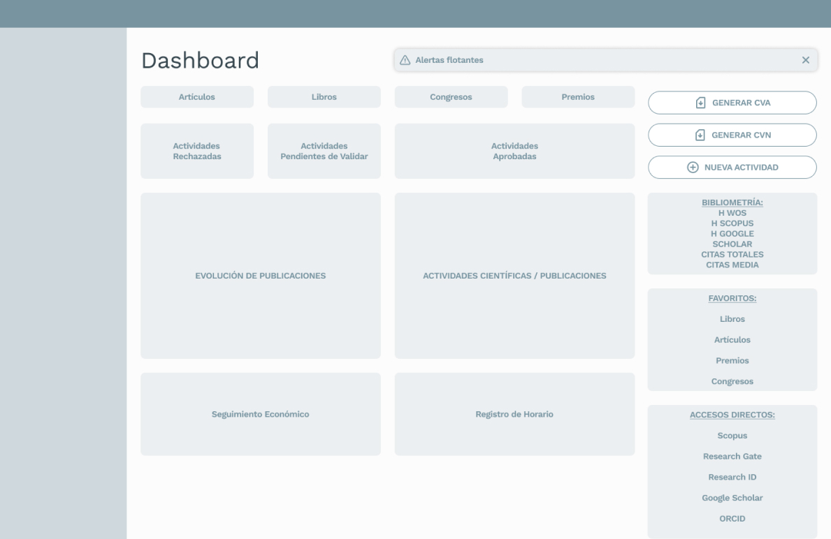
Dashboard wireframe
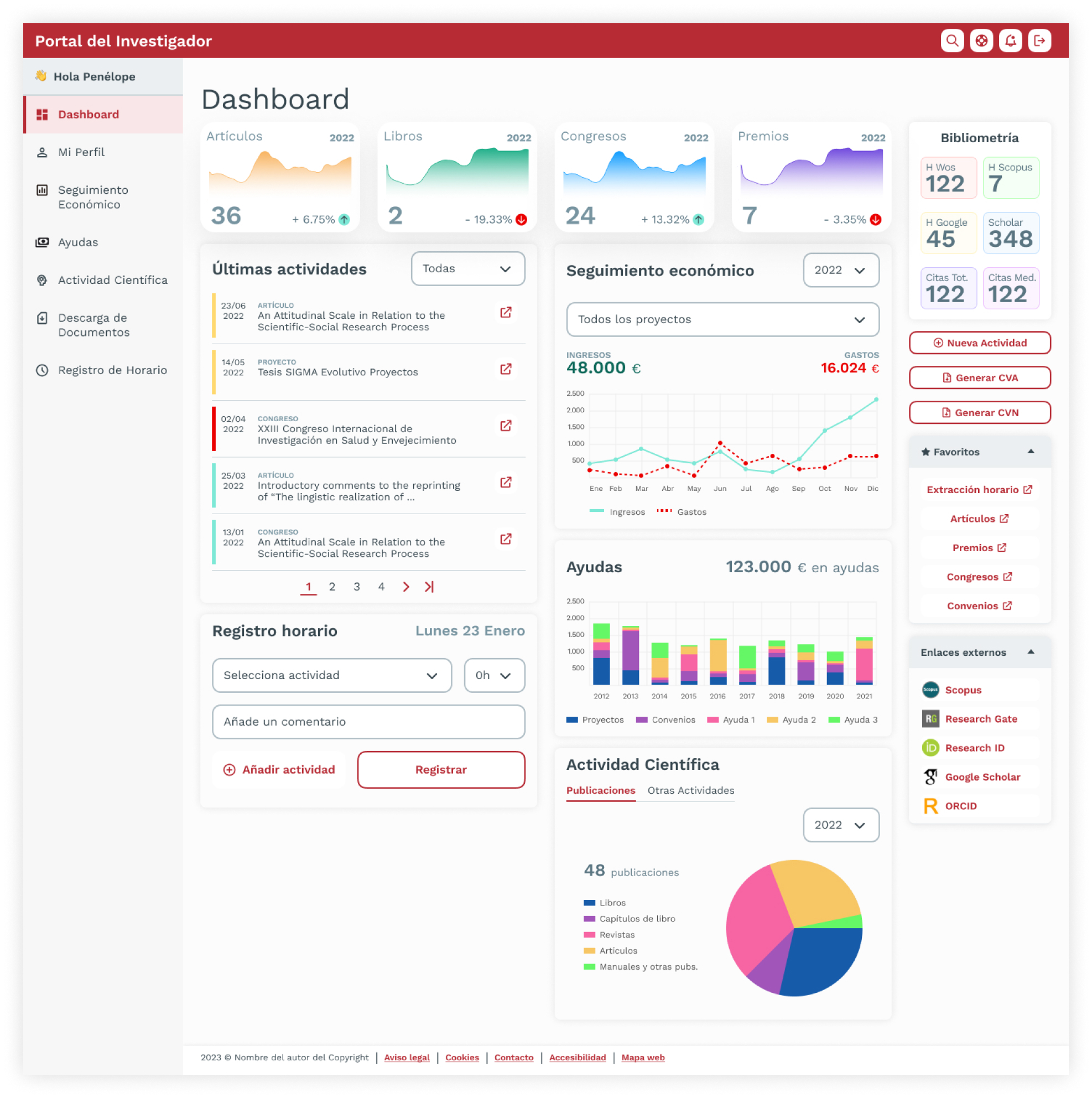
Dashboard (desktop version)
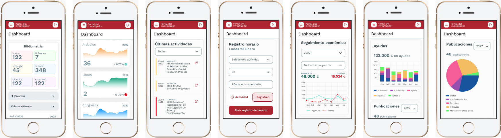
Dashboard (mobile version)
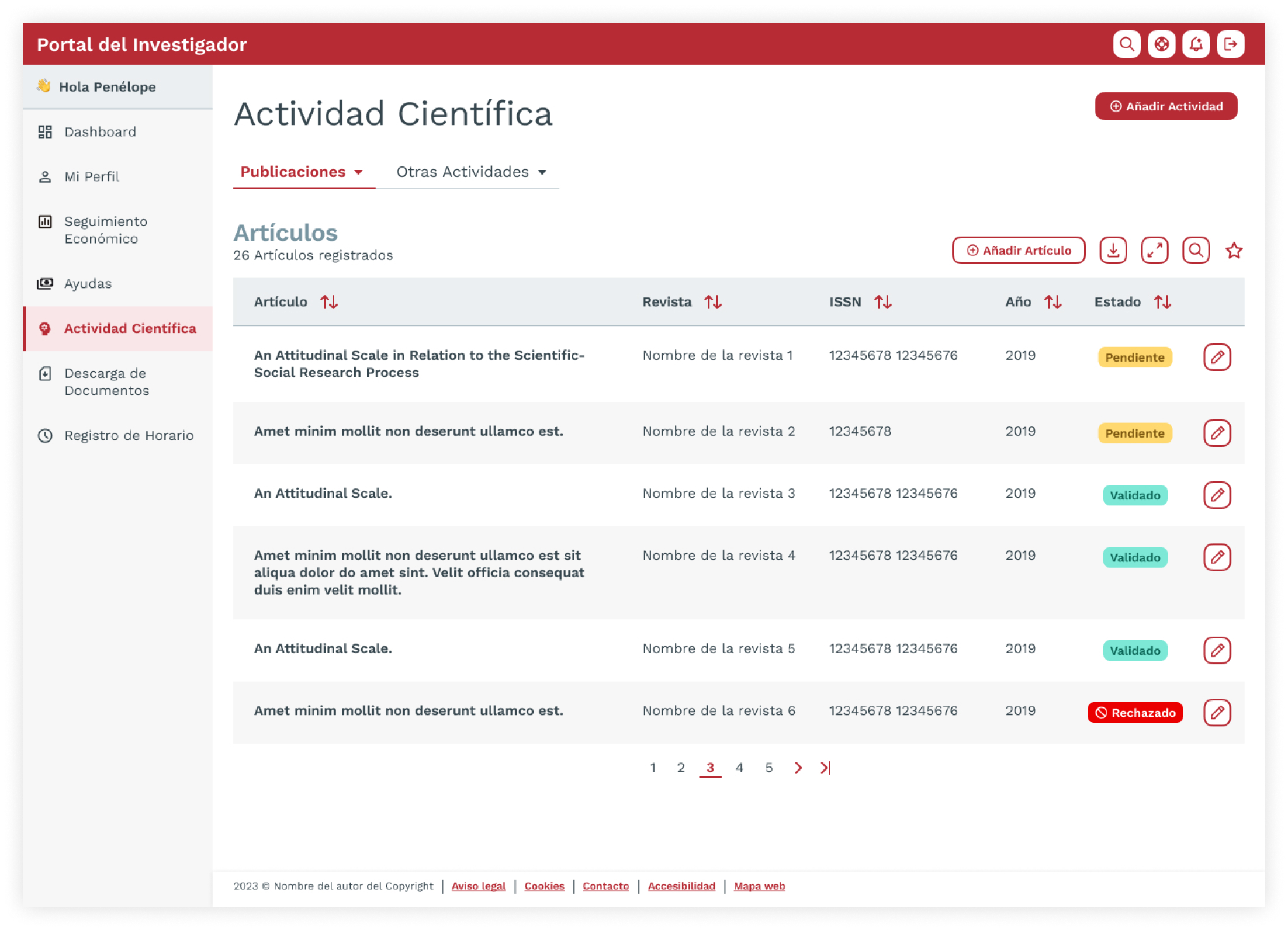
Scientific activity listing (publications)
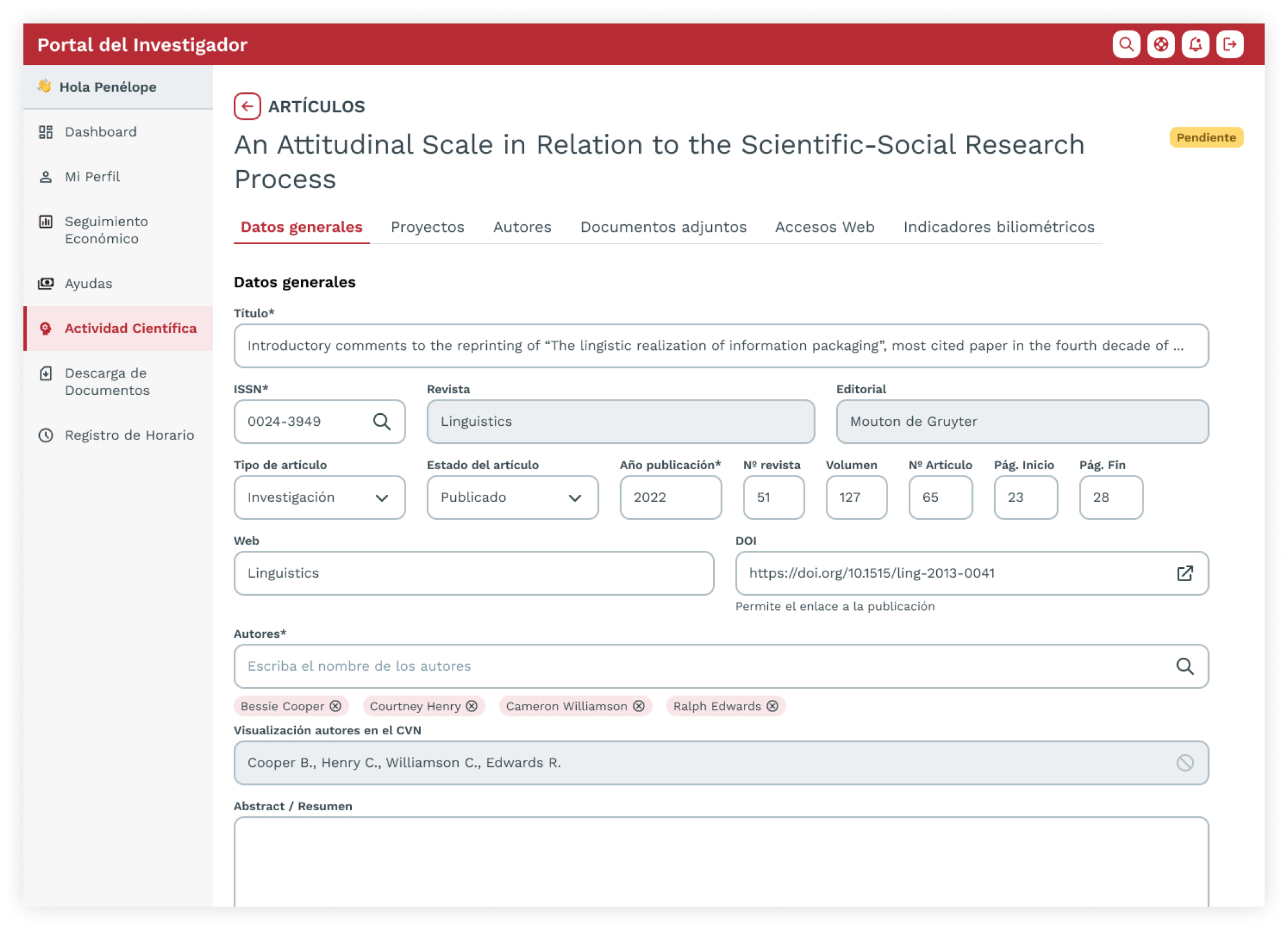
Detail page for a registered publication
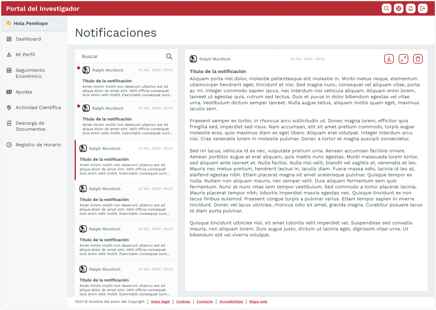
Notifications page
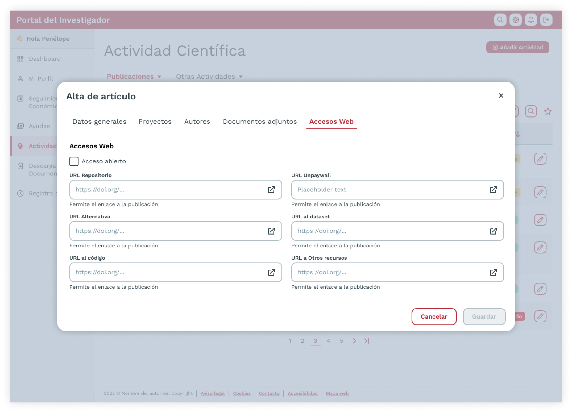
Modal form for registering a scientific publication (article)
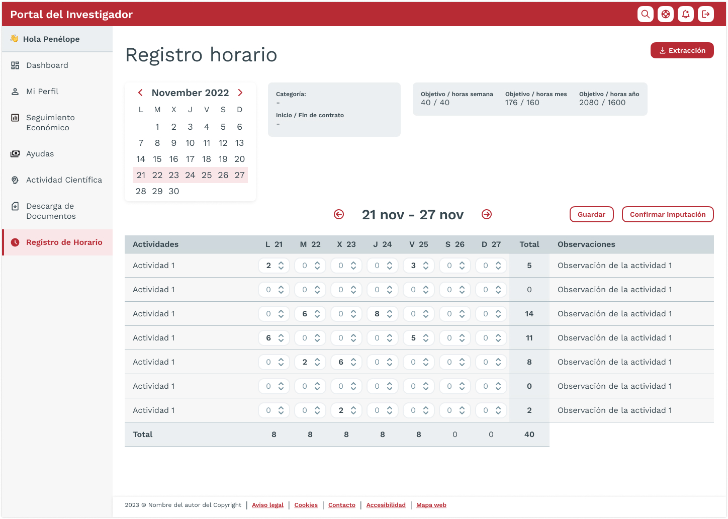
Time tracking page
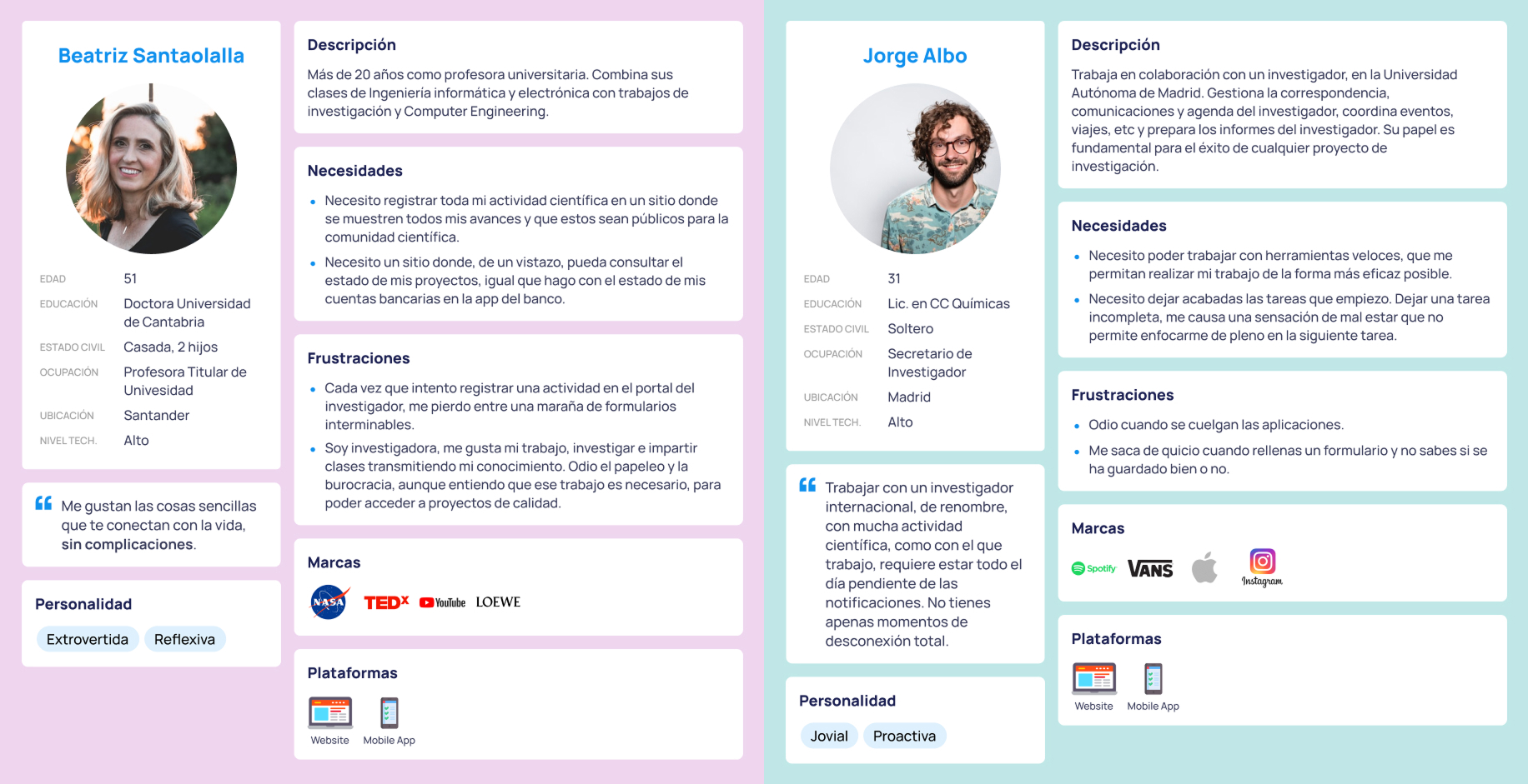
Personas (Researcher and Secretary)